Tiles to mix and match
Tiles to mix and match
When you’re decorating your home – be it a bathroom, kitchen, cloakroom or anywhere else, knowing how to mix and match tile styles, colours and textures will help when it comes to creating your dream interiors. It will also add character to your rooms and create a more pleasing aesthetic when tiles complement – or cleverly contrast with – one another.
If you’re not sure where to start with mixing and matching tiles, however, then we’re here to help with some top tips. We’ll also give a few examples of our own tiles which we recommend pairing along the way.
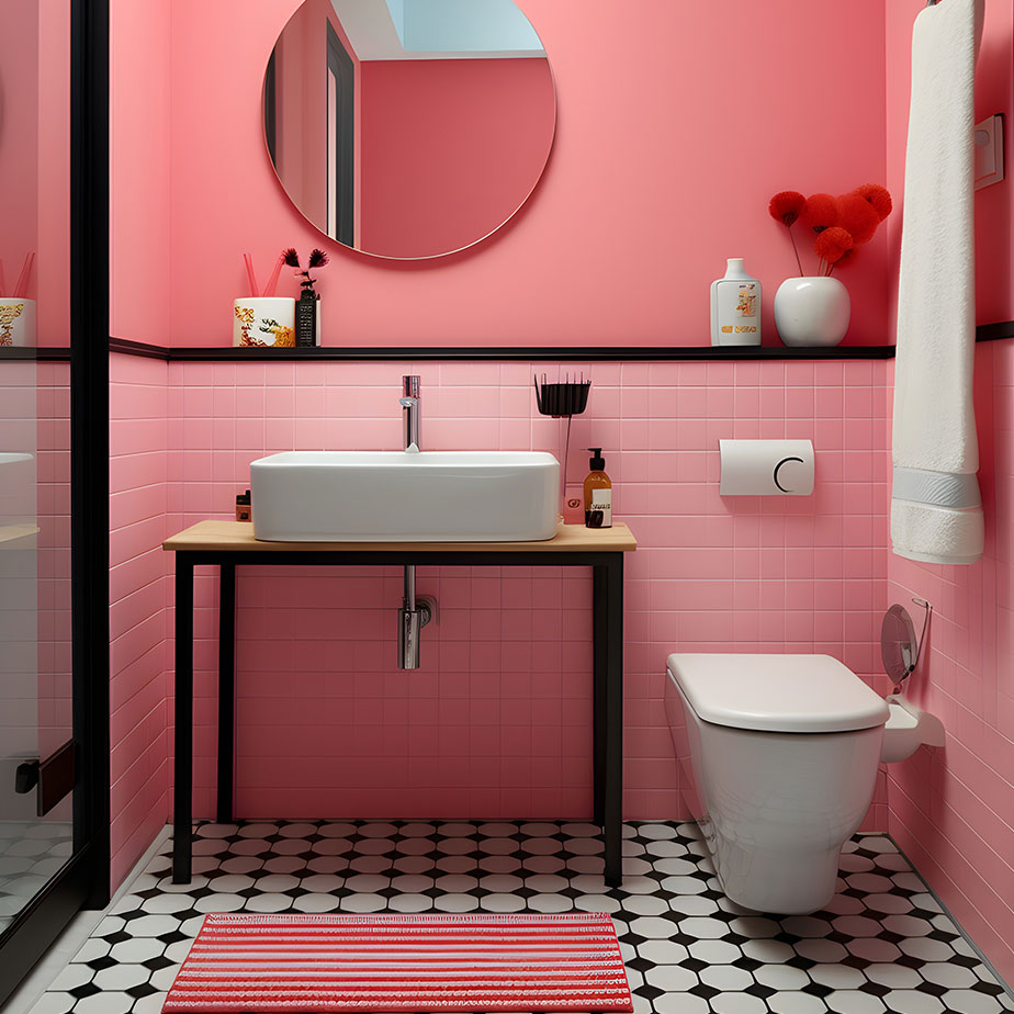
Contrasting a bolder tile tone with a more neutral one can create a nice feature area.
Perfectly paired tiles
- Clever colour choices: Before choosing your tiles, consider your colour preferences and what your specific taste is, alongside what would work well in a particular space, such as your bathroom or kitchen. Are you a bold and bright kind of person, or someone who prefers the subtle look of a more neutral palatte?
There will always be a dominant tone in any room, which should then be complemented by lighter hues – it’s a good idea to pick one dark, light and bright colour for each room and from these, a dominant tone will emerge. The mixture of light and dark will also mean you end up with a space which works much better than one simply filled with one dominant dark or light shade.
- Lighting: Think about how much natural light enters the room and how this will affect the colours used within it, along with any extra lighting from lamps, lights and bathroom mirrors. What the room is used for will also influence this, in terms of how often artificial lighting is used in the room, for example.
- Balance out busy feature walls with larger neutral tiles: Smaller tiles such as mosaics are great for creating a focal point in a room with a dramatic or eye-catching feature wall. You can experiment with patterns, textures and colours here, using interesting shapes like hexagonal or penny tiles, as well as trying bolder colour palettes or mixing in some metallic finishes – for example, copper, gold or silver. Even if you don’t normally go for such a striking look, trying it for the first time on a smaller area is a good way to try something new without investing too heavily in a style you’re unfamiliar with.
If you decide to go down this route and subsequently end up with a ‘busy’ feature wall – which could be a splashback or an area behind a bath – then using plain, large format floor tiles will help to balance out the overall room design. Similarly, choosing this same simpler style for the remaining walls will ensure that everything complements rather than clashes.
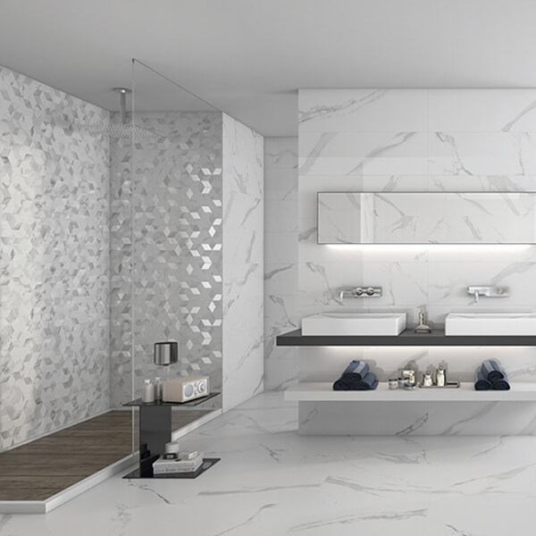
The Décor White Soul White Body Wall Tile works well with the Carrara Gris Mate Porcelain Floor Tile.
The Decor White Soul White Body Wall Tile is an example of a tile which can be used to create a stunning feature wall. It can then be complemented by a similar tone of tile with a different shape and design. The quirky rhombus shape of these small mosaic tiles has a light grey marble-effect design set against a white background and is interspersed with metallic silver tiles, the different finishes creating texture and interest. Indeed, as the light catches the tiles at different times of the day, the effect will be slightly different.
To balance out the pattern and design of the Décor White Soul tiles, plainer large format marble-effect tiles like the Carrara Gris Mate Porcelain Floor Tile work well on the surrounding walls and on the floor. They have a similar marble design, but the larger size and plainer style complements the feature wall without making the overall look appear too busy or clashing. The tones are the same, but character is created via the different size and shape of the tiles, as well as the way in which the designs are presented.
Using the same colour palette across differently shaped tiles can create texture and add interest to a room.
- Style the same shades in different shapes: If you’ve chosen your preferred colour palette and don’t want to have bold contrasts then you can create texture by mixing up the shape of your tiles. This is great for bathrooms, where you can choose from rectangular, square, hexagonal and circular tiles, for example, using similar tones but combining a range of shapes. The tiles can also have the same or contrasting finishes – so you can mix matt with glossy or satin – while a hint of metallic glint can add another interesting element to the space.
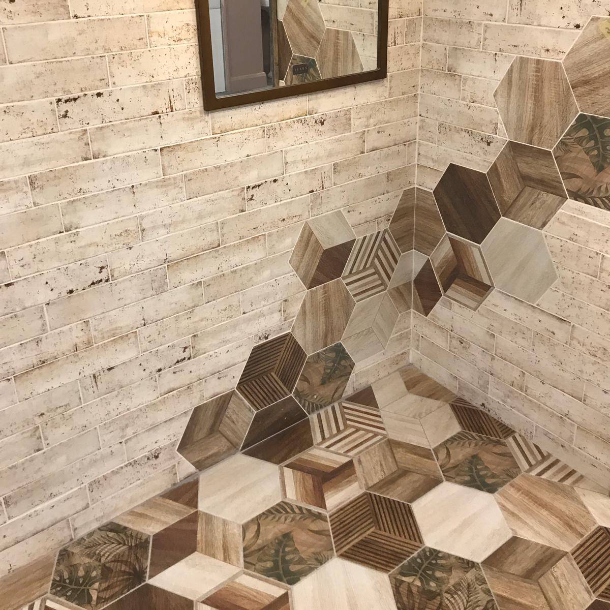
Mixing tile styles like this will transform what could otherwise become a boring, linear space into an interesting room with a cohesive look which has layers and a design that flows seamlessly together. For example, the wood-effect and leaf-design patterning of the Africa Hex Matt Porcelain Tile can be paired with a similar tone of tile in an opposing shape.
The hexagonal design here looks great matched with the rectangular shape of the Norai White Matt White Body Wall Tile, which works from a similar colour palette but has a soft satin finish and contrasting design. The patchwork style of the Africa Hex tile subsequently complements the more linear brick appearance of the Norai White tile.
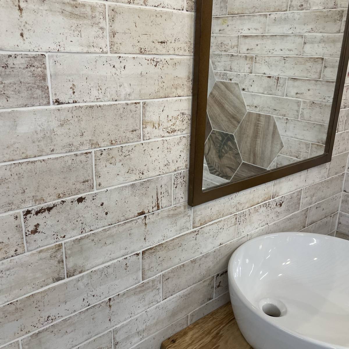
The brick style of the Norai White Matt White Body Wall Tile works well paired with a contrasting hexagonal tile.
- Accented floors and walls: Alternatively, you might want to use a bolder tile on the floor and pair it with lighter wall tiles – or vice versa – to create an accented feature. Whichever way you style it, this is a great way to really showcase your favourite tiles and create an eye-catching space which ties everything neatly together.
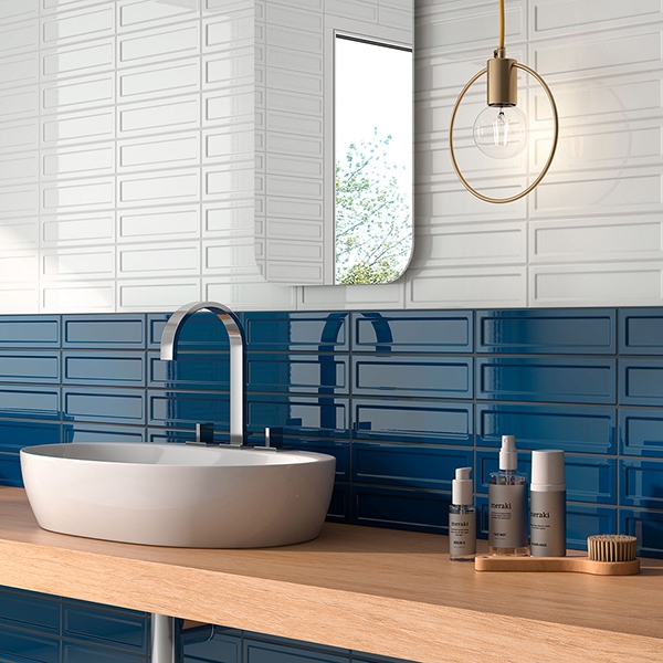
For example, the Cool Blue Brick-effect Wall Tile in Blue Porcelain can make an impressive accented wall, paired with a plainer floor tile, like wood-effect flooring. This contrasting tone complements the deep blue glossy wall tile, which has varying deepness of colour flowing across the tiles, alternating between deep blue and lighter hues.
The overall effect creates a watery, ripple-like appearance, which subsequently looks best presented alongside a less dramatic tile on the floor. The small square shape of these tiles also works well with the rectangular-shaped floor tile, which adds depth and character to the interior design.
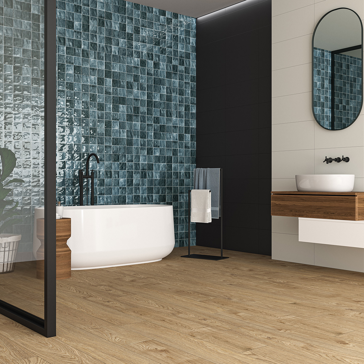
The Cool Brick-effect Wall Tile in Blue Porcelain makes a great accented wall.
For more tile style inspiration, why not call into your nearest Bathshack showroom and our team will be more than happy to help with tips and advice on great matching pairs. With a wide range of tiles to choose from – suitable for floors and walls and for everything from kitchens and bathrooms to hallways, living rooms and more – we have tiles to suit every taste.
Whether you want bright and bold or prefer a more natural colour palette – would like shiny gloss or a more modern matt look – we have textured tiles and patterned; colourful and neutral; mosaic, metro, large format and much more.
For more tips on mixing and matching tiles visit your local Bathshack showroom and have a chat with one of our team. Alternatively, email us at info@bathshack.com or call (028) 9077 0188.